


Objectives
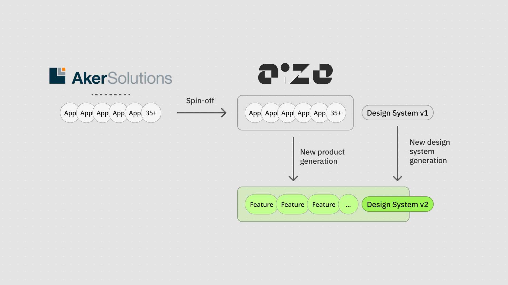
We were tasked to rework the entire design system in parallel with a new generation of our product. The product were a combination of around 40 small applications as a spin-off from Aker Solutions. Throughout the rebranding and product rework process, we aimed to unify the experience, learned from our previous experience, and fixed the design and tech debt that we didn’t have a proper opportunity to touch.
My role
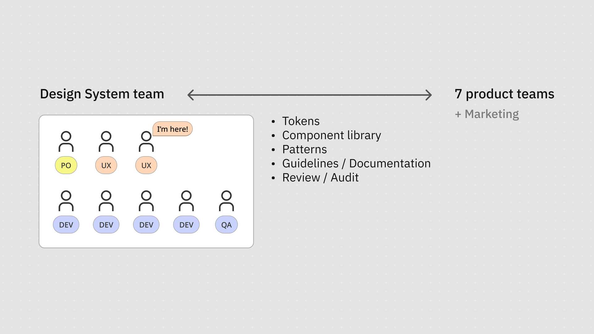
I am one of the two designers in the design system team. In this initiative, I was responsible for around half of the tokens, components, and patterns. I also collaborated and helped the other designer, the design lead of the team, to define the strategy and ways of working.
Challenge
Migrate design system and product exploration together

The challenge came from the migration in parallel on both the product side and the design system.
- Design system is supposed to be slow and to stablise the product exploration. The ideal conflicted against our migration, as it was hard to create mature components while the product teams were still working on novel and explorative idea. The use scenarios kept changing and made it difficult to scope the components down.
- Secondly, we needed to adopt the product branding guidelines from an agency we hired. Their guidelines looked fancy but did not consider accessibility and component structure well. We needed to comply with the new design languages while localising them in our product context.
Approach
Support wild product exploration with structured delivery
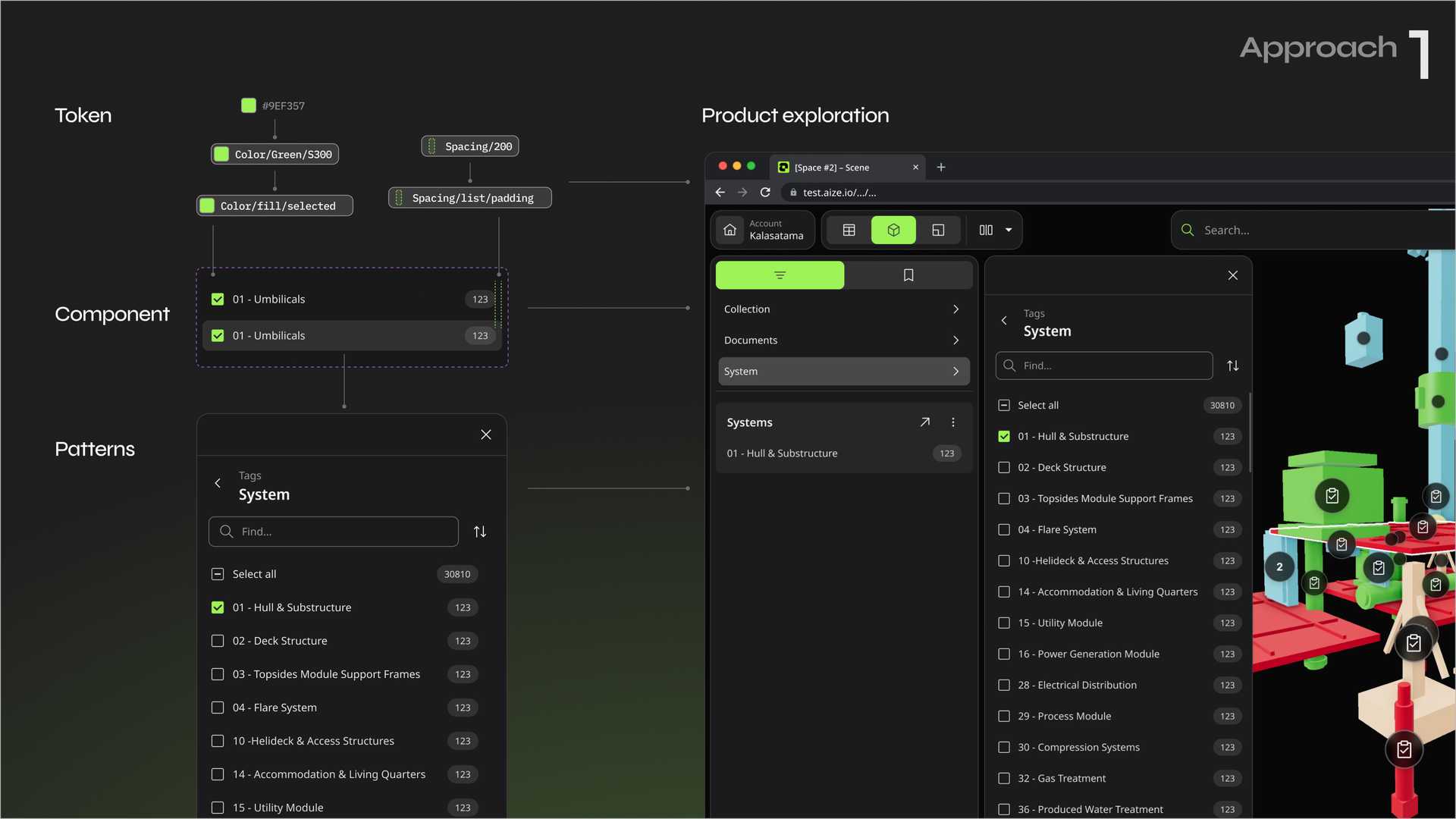
We structured our delivery with the different tiers: tokens, components, and patterns. By breaking down the tiers, we could define the ownership and scope smarter, and support faster product exploration.
For example, when the product teams wanted to create a set of component for a very conceptual user flow without design system components, by using the properly structured tokens, they can still ensure the consistency of our design language. What's more, if we decide to adopt the conceptual design to our design system, the assigned tokens can make the process faster and more transparent.
Smaller component scope
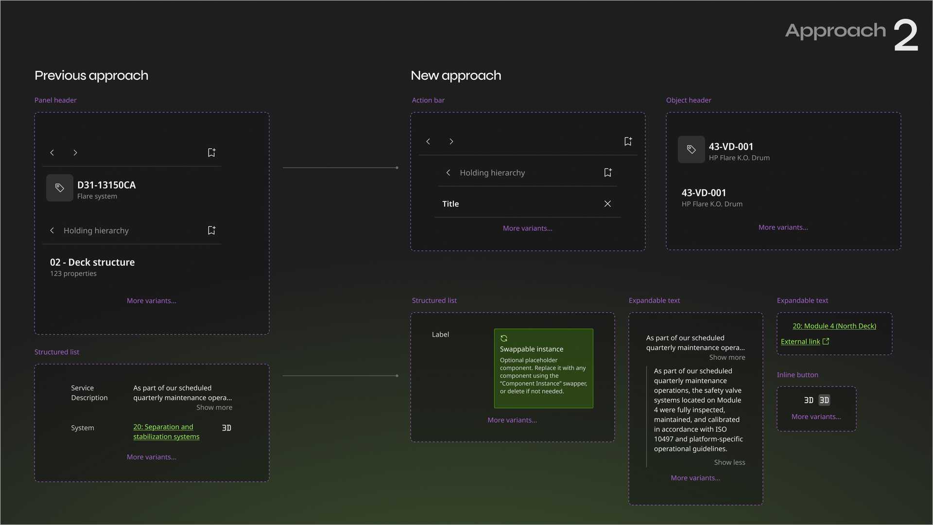
Instead of focusing on use scenarios and creating bespoke components, we shifted our focus to the shapes of design. We managed to keep the component specific and simple. We broke down the big components into smaller simple components and made them agnostic in terms of use cases.
Improved governance and federated contribution

We changed our workflow. During the rebranding project, we aimed to be more active and provocative. We organised syncing session for and with designers on a weekly basis. We prepare for the theme, presentation, mini-workshop, and questions in advance. It became a new ritual and a platform for all designers to learn the latest progress on the design system side and allow them to contribute. It helped us to adopt the new design language and align in a more organic and collaborative way.
The teams needed to create their own custom components fast but still comply with the new design language. We created a process and documentation space for them to safely work with and share their documentation with the other teams. The improved transparency of documentation also allowed us to adopt and internalise their work into the new design system more efficiently.
Create design tools for teams to run faster
The teams needed to create their own custom components fast but still comply with the new design language. We created a process and documentation space for them to safely work with and share their documentation with the other teams. The improved transparency of documentation also allowed us to adopt and internalise their work into the new design system more efficiently.
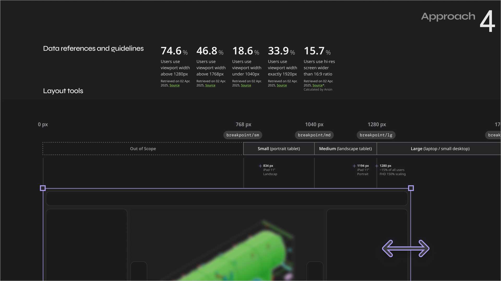
Accelerate and scale prototyping with vibe coding
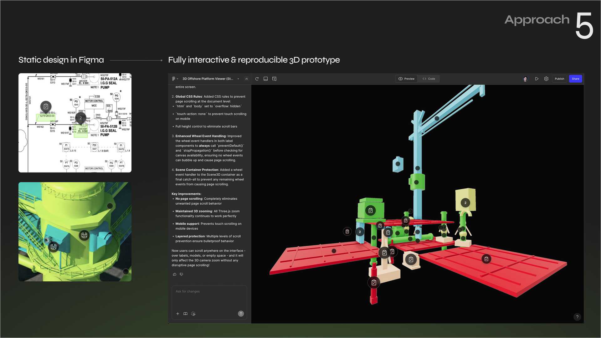
The unique nature of digital twins requires extensive prototyping in both 3D model viewers and 2D collaborative canvases. Accomplishing this in Figma Design is challenging. We adopted the latest Figma Make feature early on to enable rapid prototyping and efficient concept validation. For example, we shortened the design delivery of the data label components into 1 sprint, compared to the previous version.
Working closely with our developers, we broke down the prompts into small, specific steps. These steps help minimize errors and prevent the AI from exploring unrelated directions, ensuring more consistent and reproducible outcomes for designers. Additionally, we established a standardized set of prompts that empowers designers to independently create 3D testing boilerplates.
Outcome
The rework is still an ongoing process as of this writing. In a one-year period, we has created
- a new token system defining the colours, spacing, typography, radius, breakpoints, etc
- a documentation framework
- a minimal set (approx. 25 components) of essential components that can speed up and unify the ongoing UX exploration
- a few key patterns for cross-component governance and particular use scenarios
- a regular design audit and syncing ritual that accommodates a company-wide new ways of working
It reinforced my belief that a successful design system isn’t just about components. It’s about culture, communication, and creating space for contribution and iteration.
Note
Confidentiality concerns
All visual materials in this article were created solely to illustrate the process and outcomes of this project. They do not represent the actual product and respect the company’s intellectual property and the client’s business confidentiality.