


Objectives
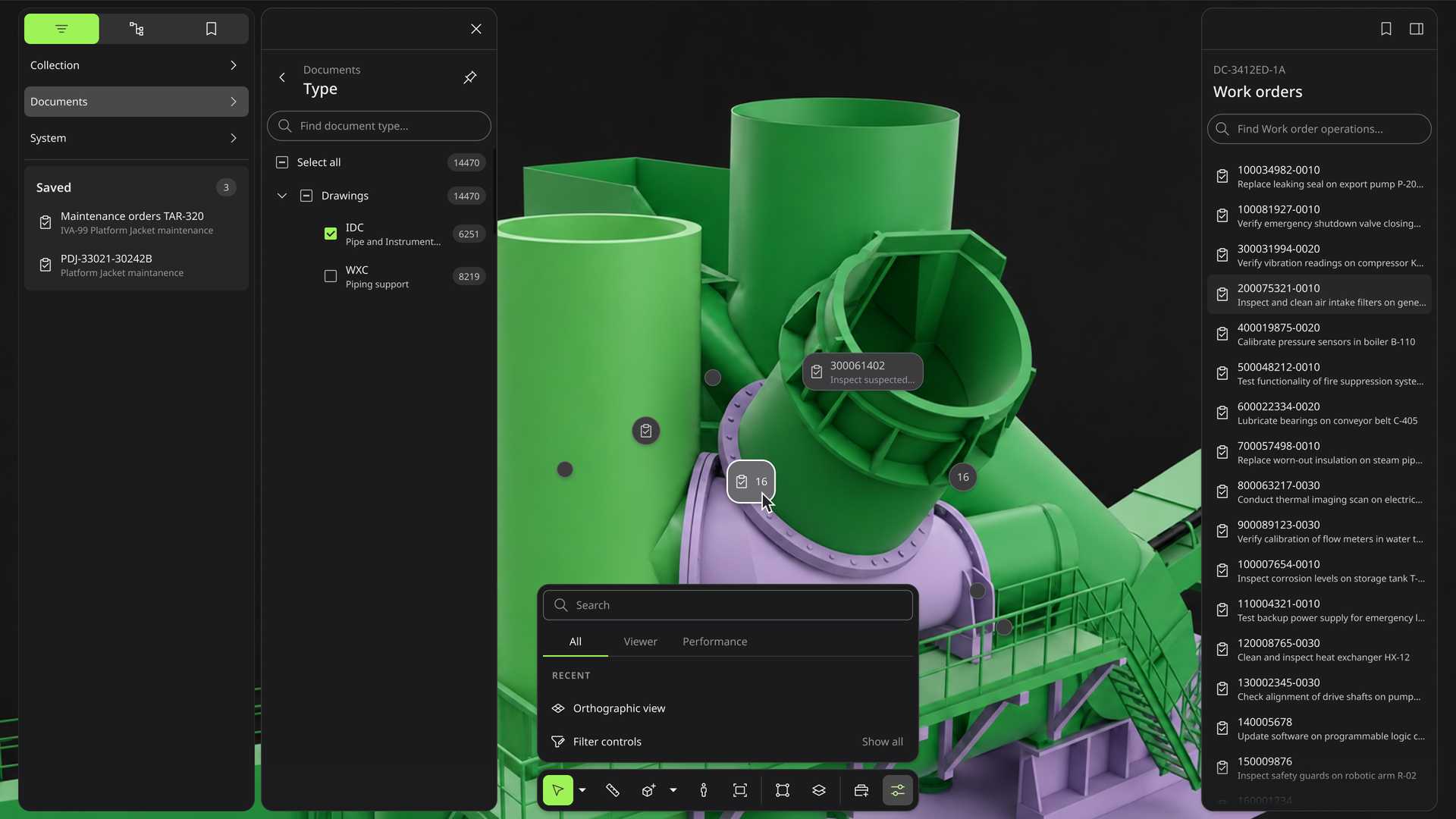
The goal of this project was to integrate the UX patterns of our digital twin and improve the product experience. Our digital twin product was spun off from the software department of Aker Solutions, a global Norwegian engineering and technology company for the energy industry. It inherited around 30 to 40 product lines, which were solutions built in different periods for different use scenarios, and that made integrating their user experience a huge challenge.
Here I want to share how we integrated the UX patterns for objects and tools. I picked these two because I was the person mainly responsible for this work, and because they are particularly important in a digital twin product.
The first one is Objects. Objects are the most basic data a digital twin presents. In the energy industry the common ones include physical objects (Tag), work orders, documents and anomalies. Our users have to work with these objects to get their jobs done. In the past, the same object often did not look or behave the same way across our user flows, and different objects were not distinguished in a consistent way. It made the product hard to use, because it fragmented our users’ mental model and raised the cost of learning and using the product unnecessarily.
The second case is Tools. Tools decide how users interact with the digital twin. They sit in the toolbar at the bottom of the screen. Four of our seven product teams designed their own tools, so there was little consistency between them: similar tools ended up in different positions in the toolbar, and the interaction differed from team to team. The same tool could sit on the left of the toolbar in one place and on the right in another. Sometimes it opened a menu, sometimes a popover or a second-level toolbar, with no consistent rule behind it.
My role
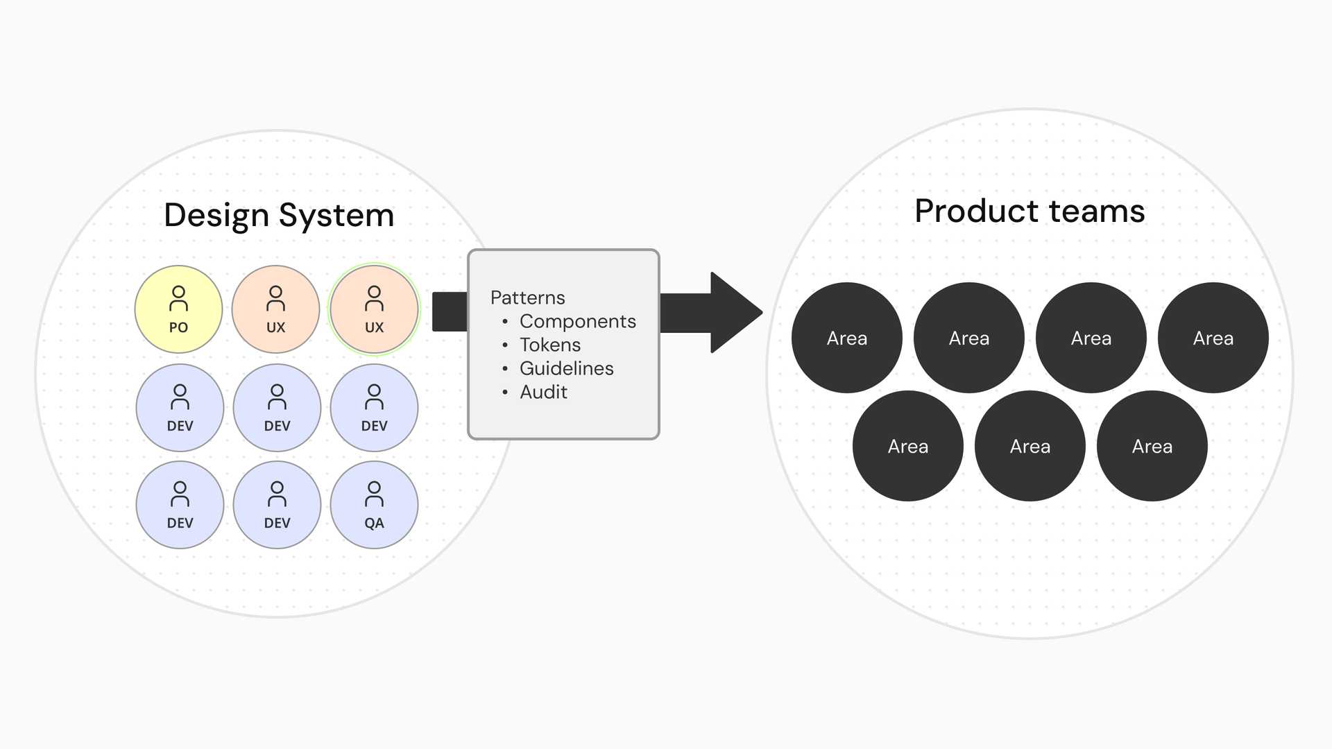
I led and owned the UX patterns for tools and objects, working with the design system team and the seven product teams. I mapped out the objects and tools of the digital twin, and built consensus among the stakeholders. I redesigned the related tokens, components and patterns, and delivered them together with our engineers. After that I worked with the product teams using them to refine the design system guidelines, to design agent skills that make prototyping more efficient, and to automate design quality checks.
Challenge
Similar objects, divergent experiences
The 30 to 40 product lines in the digital twin were originally built separately, and the spin-off is what brought them together into Aize as one company. Each of them presented objects in its own way, and there was no mental model that was easy to understand.
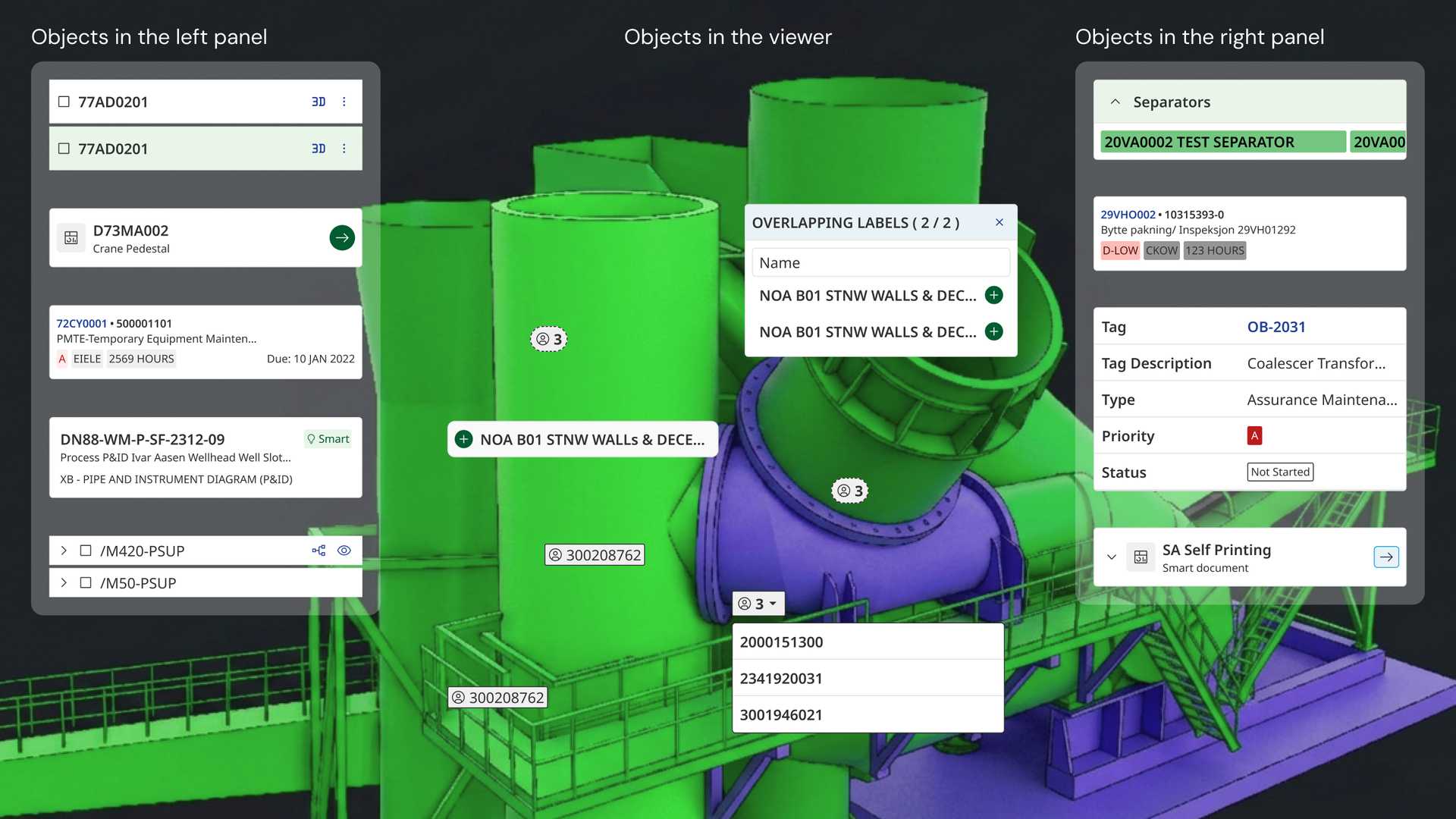
That made the product difficult for our users. They hold deep domain knowledge of the equipment in the energy industry, but as long as the product lacks a mental model that corresponds to the real world, they will struggle to learn it and to use it.
A toolbar with four authors
The toolbar problem also came from the organisation being poorly integrated. Four teams in total took part in designing it: 3D Viewer, 2D Viewer, Table view and Webapp. Each of them had its own schedule and goals. Previously we only had one guideline, which required the toolbar to sit at the bottom of the screen. The four teams were free to design the inside of it. Because there was no other guideline, changing the toolbar meant booking a meeting or a long asynchronous exchange. Our designers were also spread between the UK and Norway, and some colleagues only met once or twice a year, which made organic and direct communication hard.
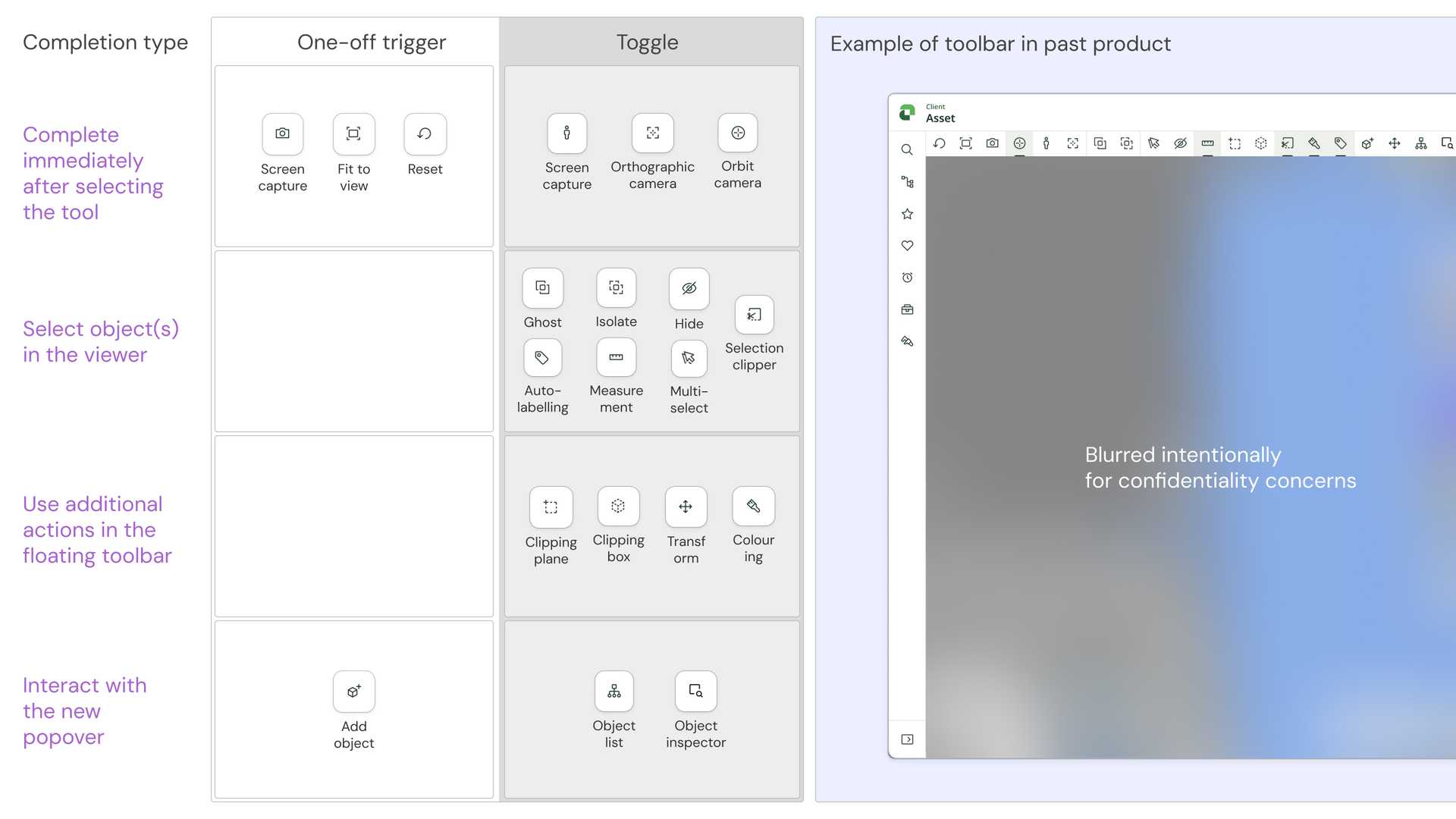
This left many inconsistencies and defects in the toolbar experience. For example, in the toolbar led by one team the tool types were ordered ABCD, and in the toolbar led by another team the order became DCAB. Users told us in earlier testing that the inconsistency confused them.
We also found that the pattern guideline documents in the design system tend to be long, long enough that people do not always have time to read them through, and do not absorb them even when they do. In other words, even once the guidelines exist, we still have to improve the usability of a long document in real design work.
Approach
A holistic delivery strategy
For the problems that objects and tools ran into, we had a holistic delivery strategy. Tokens, components and patterns are three layers of one delivery, and each layer only holds because of the one under it. Tokens carry the visual language, components are the basic parts, and patterns govern how those parts may be assembled.
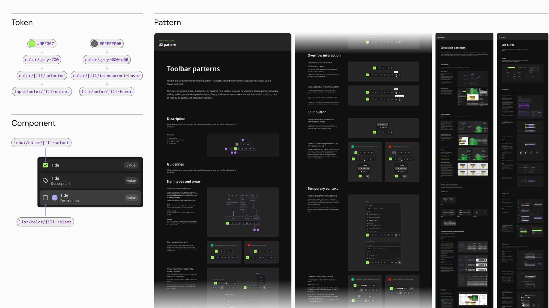
Mapping the objects and tools
To work on how objects are presented, we first had to be clear about which objects exist in the digital twin. We chose the OOUX framework as our mapping technique and built the map together with stakeholders from different teams. It gave us an overview of every object in the product, and it forced us to align our understanding with each other, since this is a domain that needs deep prerequisite knowledge.
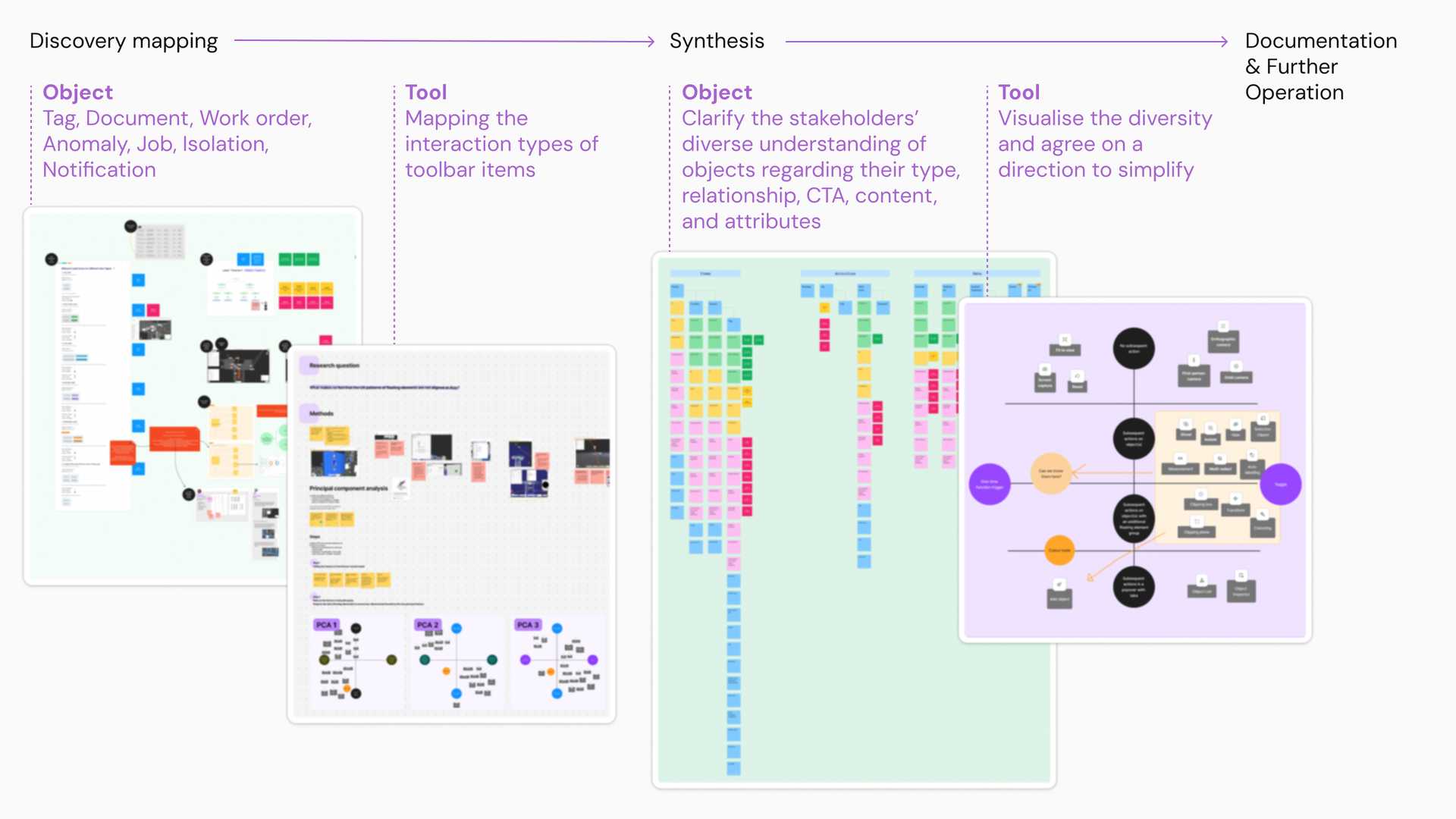
We also took stock of all the tools, classified them by their characteristics, and discussed the priority of their presentation and usage with the stakeholders.
Besides giving us a clear overview, these maps helped us anticipate the new objects and component requirements we would have to consider later, so that what we designed at the time stayed scalable.
Prioritisation for component creation
For objects, we picked the components around Data Label and List as our two priorities. Both are everywhere in the digital twin, so investing in them returns the most. For tools, the components had already been finished in earlier work, so we focused on the patterns.
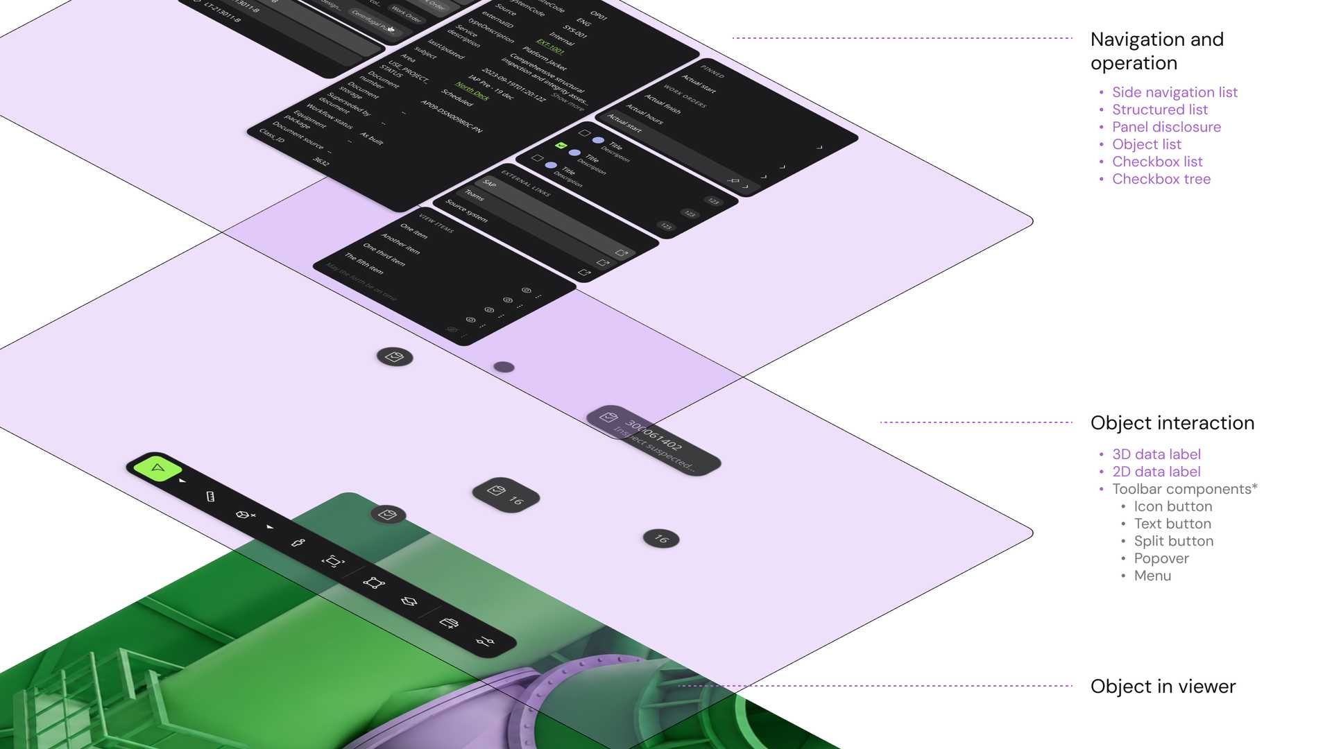
Pilot components with the highest return
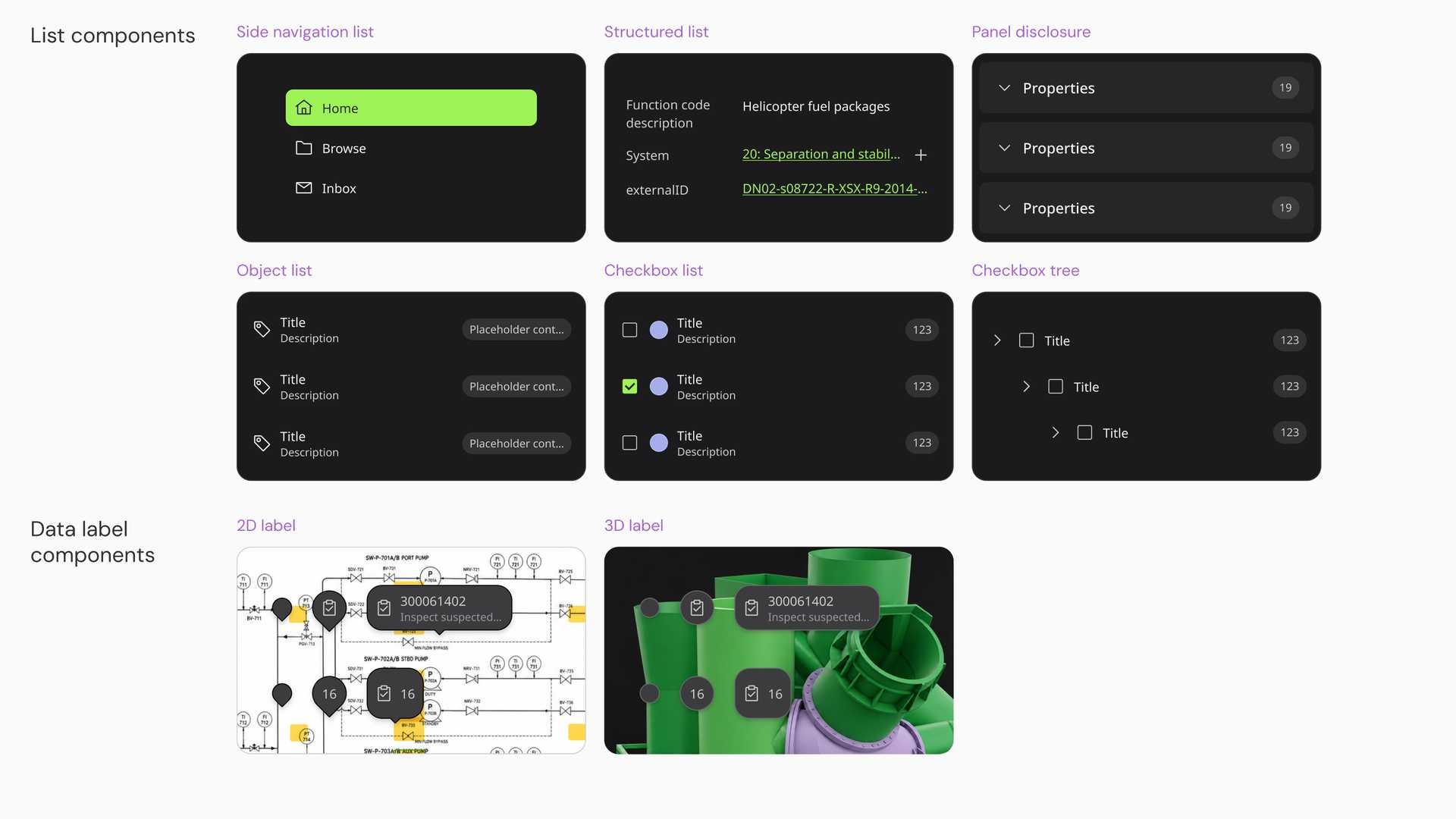
We designed and developed Data Label and a set of List components as pilots. They validated the object-oriented approach and answered the most urgent needs of the product teams at the same time. Along with them we created the related alias tokens, so that new components in the same family could follow the same visual language later.
Key patterns to govern the objects and tools
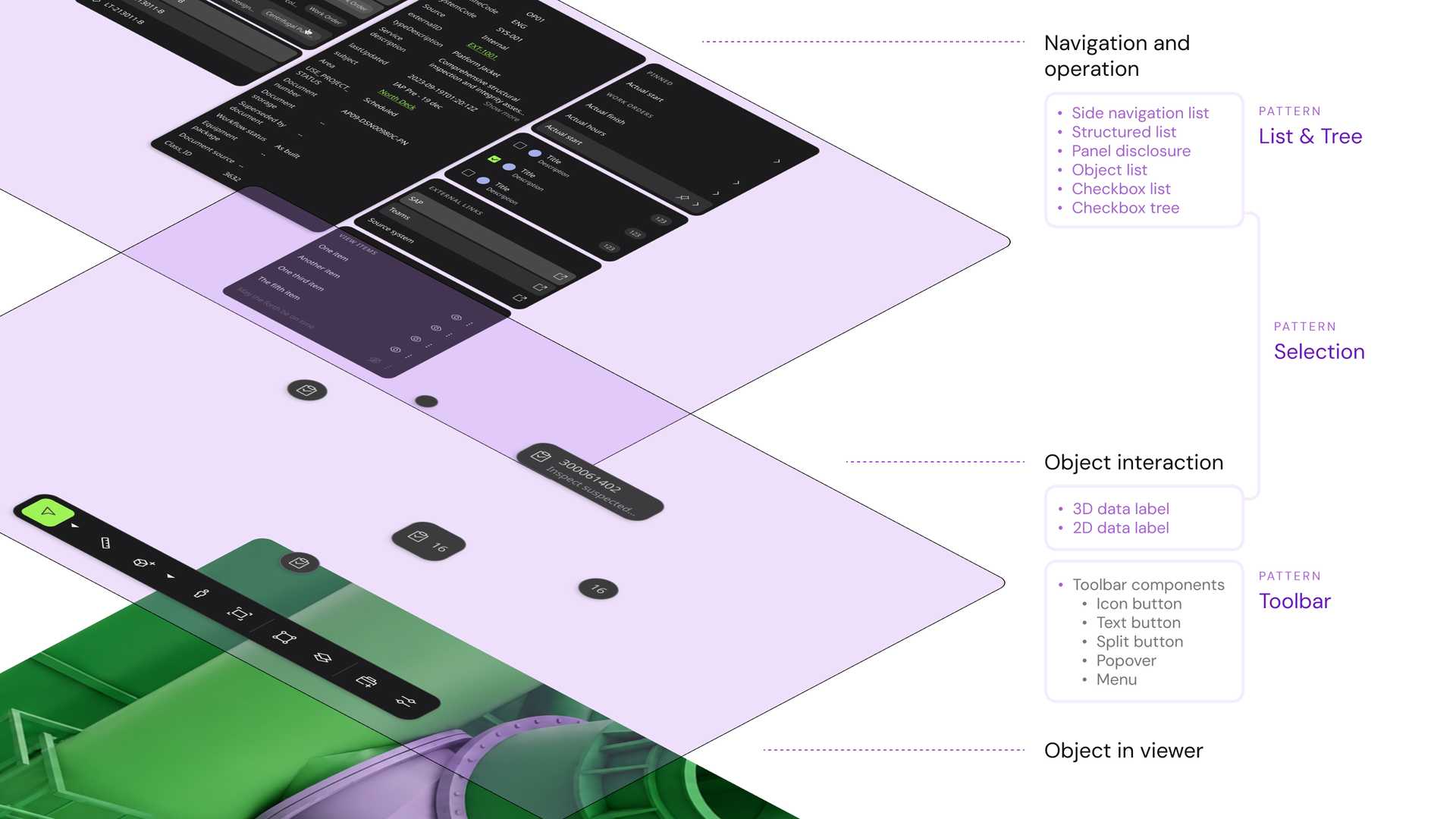
List consists of six components, and Data Label has two sets of components. The toolbar involves many different buttons, menus and popovers. We needed UX patterns to help designers understand which kind of component belongs to which area of the product, in what order they are arranged, and which interactions are allowed and which are not.
We wrote three. The List and Tree pattern and the selection pattern govern objects, and the toolbar pattern governs tools.
Orchestrating the diversity of objects
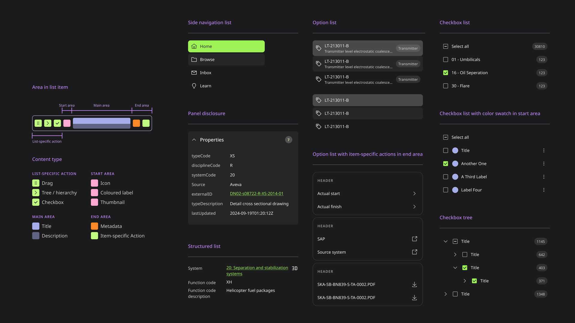
The List and Tree pattern aligns the different presentations of the same object. For example, the same work order can appear in a search result, in a history panel and in a folder the user created. We want them to look and feel like the same object, while still supporting the behaviour that each context calls for.
We reach that balance by unifying the UI information architecture inside similar components.
A strong cognitive connection to each object
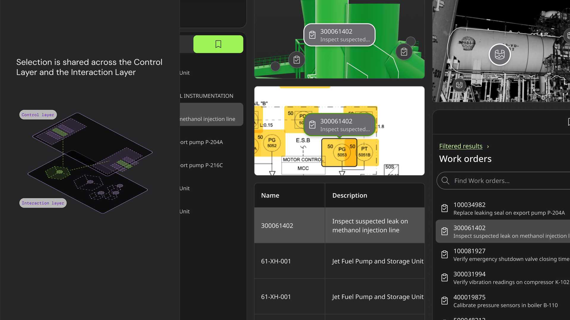
The selection pattern carries an object across areas. When a user selects an object in one panel, the same object is highlighted in the viewer and in the other panels at the same time. That connection in the experience lets a user hold the same object in mind throughout the product journey.
Users know what to expect before clicking a tool
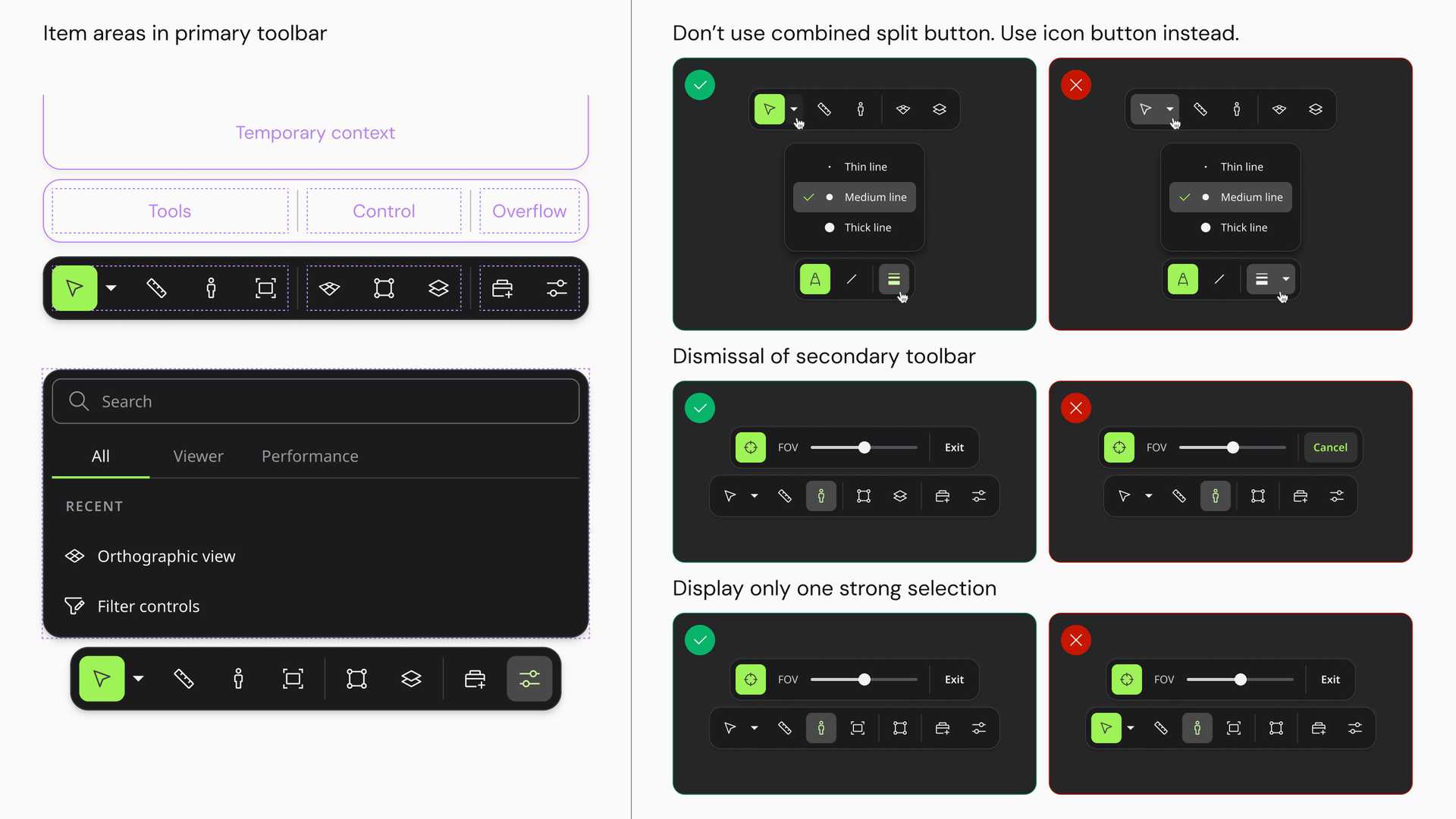
The toolbar pattern is about predictability. We group tools by interaction type and priority, and we define in advance what kind of interface opens when a tool of a given type is used. For example, as long as a tool changes the environment settings of the viewer, it may only use an icon button and not a split button component.
A user who has learned some of the tools in the toolbar can then predict how the other similar tools work, and that is what lowers the cognitive load.
Refining the guidelines through collaboration, iteration and review
Providing components alone was not enough. We interviewed and ran workshops with managers, designers and developers to build trust and collect feedback on how the components were used. We documented the key experience patterns that cut across several components. These patterns include key examples, so they can be referenced and also improved.
An internal tool for design quality assurance
Design systems generally rely heavily on documentation as the cornerstone of governance. But as the product grows, the documentation gets longer and harder to read, which turns review into a specialised skill of the design system team. Often what people need is to review their own early work themselves, immediately.
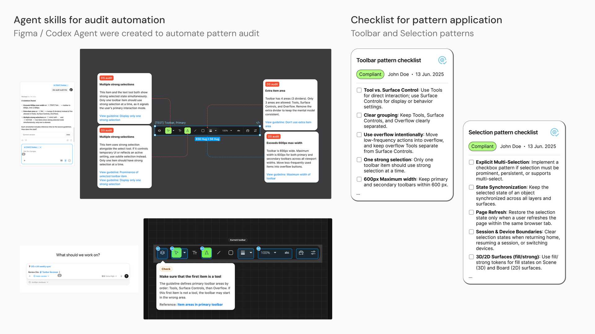
So on one side we gave the product teams a heavily simplified checklist, and on the other we used AI to automate the design quality audit.
For the part that AI automates, we split the process into Scraper for reading and Audit for applying.
The Scraper skill converts our existing design system documentation in Figma into a form that both Figma Agents and Codex can work with. It does not require us to redo the guidelines. Instead it follows the existing structure of the documentation, converts the text content into markdown, and saves the guideline’s example illustrations as PNGs, so the LLM reads them visually and we spend fewer tokens.
The Audit skill then reviews a design the user selects against what Scraper produced, and it runs either in Figma or in Codex. The feedback arrives as annotations, and each annotation carries the original source in the design system documentation.
Outcome
The toolbar experience got consolidated
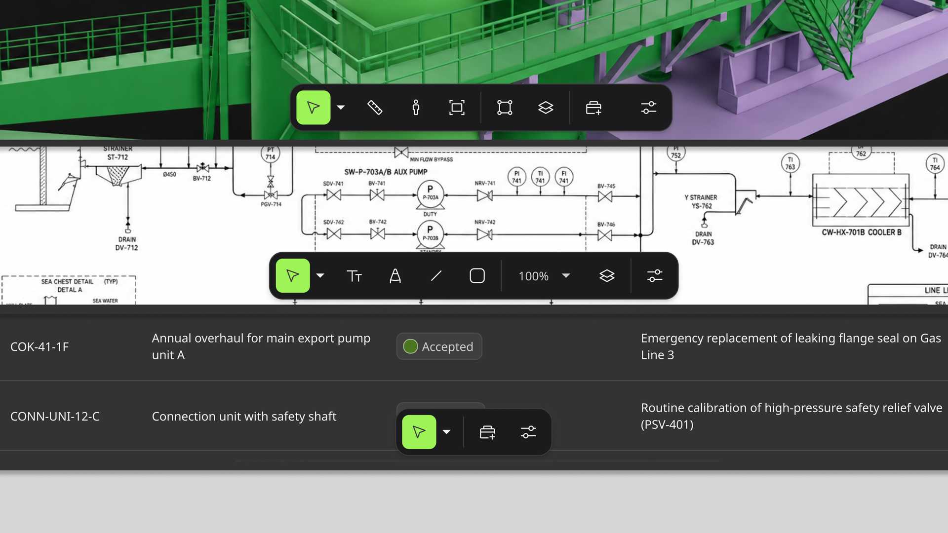
We classified the tools and built the basic interaction principles around interaction type and priority. We also named the UX patterns the product tended to fall into, and wrote them into the documentation. The same tool now sits in the same place and behaves the same way, whichever area of the product a user is in.
Object selection became consistent across the viewer
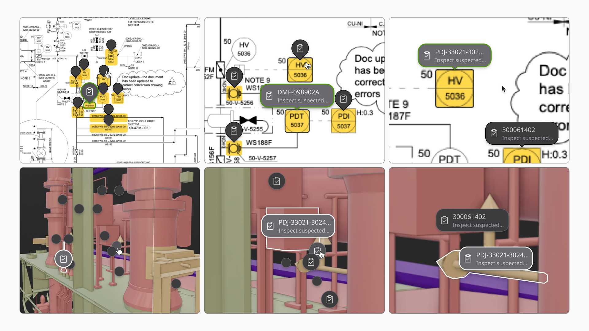
The Data Label component signifies different object types with strong visual connections to other elements like List, displaying key information such as ID, description and time series across single, group or cluster labels. It supports colour coding for data visualisation and adapts seamlessly to both 2D and 3D industrial environments.
Objects feel connected across the product
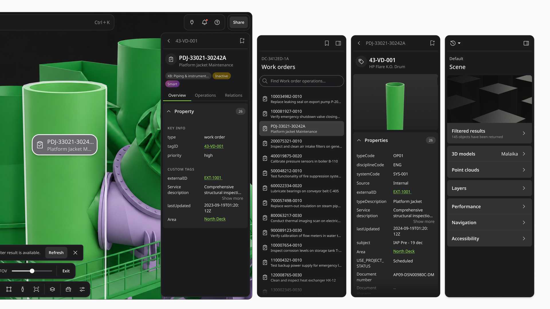
The List components provide a consistent structure for the object-oriented user journey, covering search results, object history and user-created folders, while maintaining visual coherence with Data Label. They include well-defined interactive states, clear usage guidelines and configurable swap-in actions, and their usage is governed by the pattern documentation, which keeps them consistent.
After release both were widely adopted, and they replaced the various custom components that had accumulated across the software.
Shared goals and directions for improvement
While developing the toolbar, selection and List and Tree patterns, we took the chance to design wireframes and a roadmap for the related components Tree, Card and Tag. That gave stakeholders a reasonable expectation of the future work of the design system, and a shared goal to develop towards in the product.
Users also fed back that ambiguous guidelines make the audit skill produce inconsistent results. The quality of the annotations is highly correlated with the clarity of the guidelines behind them. If we do not write it clearly, the tool cannot tell an optional recommendation from a mandatory rule. The feedback that comes out of users collaborating with AI became a way for the design system to improve the quality of its own guidelines.
Note
Confidentiality concerns
All visual materials in this article were created solely to illustrate the process and outcomes of this project. They do not represent the actual product and respect the company’s intellectual property and the client’s business confidentiality.